Metadata Editor Reference
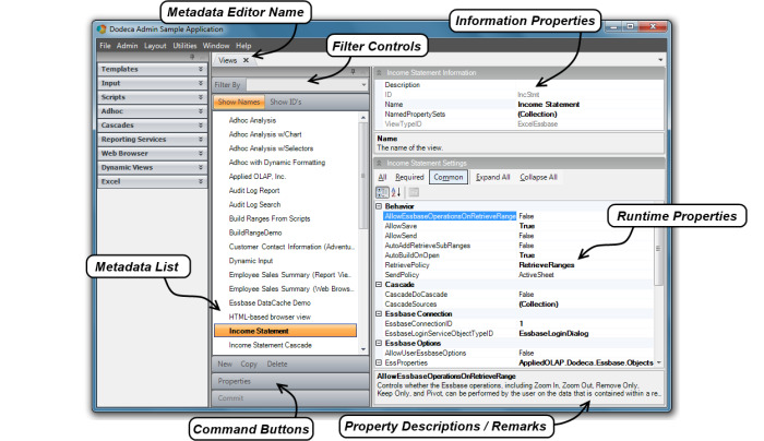
This section of the Administrator’s Guide serves as a reference guide for the various metadata editors in the Dodeca product. These editors are the key for an administrator to open Dodeca’s control and functionality. Reviewing the diagram below will give a point of reference for the various components found in the metadata editors.
Common Properties and Controls
There are some properties and controls that are common to all or most of the different metadata editors. These will be referenced and discussed first so as to avoid repeating the information in each of the editor descriptions.
Information Properties
Information Properties are found at the top right hand portion of most of the metadata editor screen views, separate from the metadata (runtime) properties. These are, for the most part, descriptive properties such as ID name, and a general description.
Command Buttons
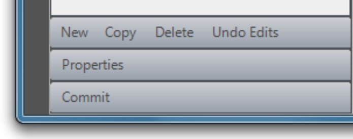
The command buttons appear at the bottom the left of the metadata editor window. There are some command buttons specific to an editor and will be discussed in that context but others, which are listed here, are common enough to cover in a general discussion.
- New
-
The New command button created a new application object.
- Copy
-
The Copy command button allows a user to copy an existing item while retaining the settings for a new item. Copied configurations can be modified after being copied.
- Delete
-
The Delete command button allows a user to delete an item in the editor.
- Undo Edits
-
The Undo Edits command button defaults the editor settings back to where they were when opening the editor in a given instance.
- Properties
-
The Properties command button gives a full screen view of the metadata properties in the Applications, Views and View Property Sets metadata editors. Using a multiple window function allows for side by side comparison of the properties from two different objects within the active editor.
- Commit
-
The Commit command button becomes available when changes are made in an editor. Clicking the Commit button writes the changes back to the metadata store. If inadvertent changes were made in an editor a prompt will ask if changes should be saved when you attempt to close the editor.
Applications
To provide a context for the discussion of the Applications metadata editor, let’s take a step back and look at how to get to the point of being able to run an application from which metadata editors can be opened and used. It is also helpful to have an understanding of what an application is exactly and what the differences are between an Admin and a User application.
From a user’s perspective, whether an administrator or an end-user, a Dodeca application is a workspace that allows the user to open and interact with multiple views. Each view is displayed in a tabbed window. A metadata editor also displays in a tabbed window, but can only be opened from within an Admin application. The metadata editors are the user interfaces for creating metadata instances, such as a view or selector, and for editing the settings or properties that define and configure the instance.
From the standpoint of the framework, each application is simply a specific instance of application metadata, which consists of the settings that control the splash screen, the workspace caption and appearance, the application-level toolbars, the view selector configuration, security, the default view and layout, application-level tokens, and session caching.
As the last step during installation, the Application Setup Utility is used to create a tenant and an Admin application within the tenant. Typically, each tenant contains an Admin application and one or more User applications, which are applications run by the end-users. Using the utility, the Admin application can be created either explicitly or by importing existing metadata that contains an application. For an initial installation, the recommended approach is to import the metadata contained in the Metadata Starter Kit, which is installed with the framework. The starter kit includes both an Admin application and a User application, along with several general purpose toolbars configurations.
The Admin application created using the Application Setup Utility is the application that an administrator uses to create and manage all the metadata instances within the tenant. It can also be used to modify the application metadata settings of any application in the tenant, including the Admin application itself.
The Applications metadata editor is where application metadata settings are edited and new applications can be added to the tenant. The application metadata instances that are accessible from the editor represent all the applications that exist in the tenant.
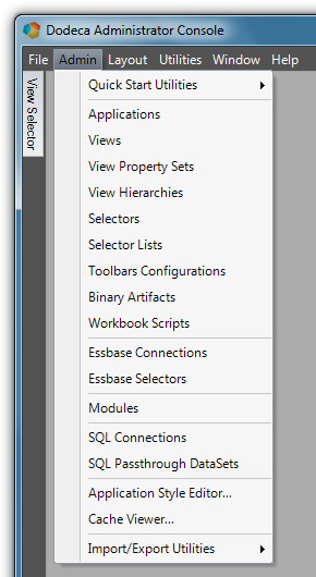
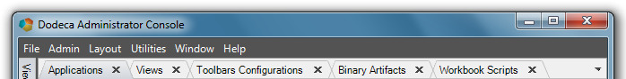
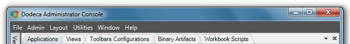
The Applications metadata editor is opened from the Admin menu.
The Applications metadata editor, shown in the screenshot below, contains the two applications that are created by importing the Metadata Starter Kit using the Application Setup Utility. These include the Dodeca Administrator Console, which is also the application being run (as can be seen in the title bar caption), and the Dodeca User Console.
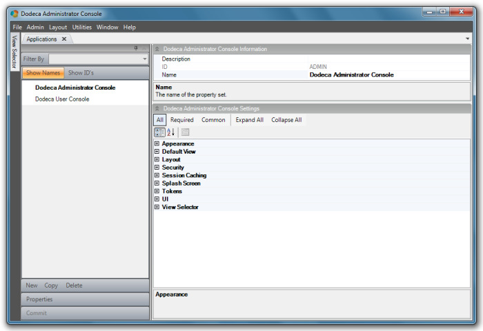
The metadata settings are grouped into the following categories: Appearance, Default View, Layout, Security, Session Caching, Splash Screen, Tokens, UI, and View Selector.
Admin Application
An application’s configuration determines whether the application can be used for metadata administration.
An Admin application allows a user to access any of the Admin tools, such as the metadata editors and the import and export metadata utilities. These tools are available from the Admin menu on the main menu bar when the UseDefaultAdminToolbarsConfiguration property in the UI section is set to True.
In an Admin application, the view selector is typically configured with a view hierarchy that contains all the views defined within the tenant. For ease of use, the view selector’s AllowEditViewMetadata property enables the ability to navigate directly from a view in the view selector to the view’s related metadata.
An Admin application is often password-protected, which is supported by the Password property in the Security section. The password provides a simple security mechanism for protecting the metadata.
| The Admin application is initially configured using the Application Setup Utility, but the settings can be edited using the Applications metadata editor. If an administrator inadvertently sets UseDefaultAdminToolbarsConfiguration to False or sets the ToolbarsConfigurationID to a toolbars configuration that does not contain the Applications metadata editor, they will not be able to access the application metadata properties from within the application. The Application Setup Utility can be used to edit and restore the setting. |
User Application
An end-user application is any application that does not allow direct access to the metadata. The ToolbarsConfigurationID setting in the UI section indicates which toolbars configuration is used by the application. The Metadata Starter Kit contains a toolbars configuration, View Console, which is assigned to the Dodeca User Console application in the starter kit. The toolbars configuration can be modified and customized as needed. Or, another toolbars configuration can be created and assigned to the application.
Application Properties
Appearance
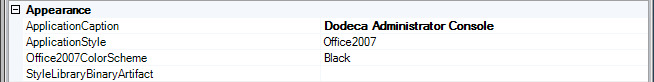
The style of an application, which primarily affects the appearance of the various user-interface components, is controlled using the ApplicationStyle property. This setting provides several built-in options that replicate the appearance of common Microsoft user-interface themes, such as Office2003 and Office2007.
When the ApplicationStyle is set to Office2007, the Office2007ColorScheme provides three options for the color scheme: Blue, Black, and Silver.
For a more customized look, a style library can be created and associated with the application using the StyleLibraryBinaryArtifact property.
Refer to the Application Style Editor for instructions on how to create a style library.
Default View
To configure an application to automatically open a view when the application starts up, use the DefaultViewID property to specify the startup view. For instance, a web browser view that displays an intranet web site can be used to post notices and keep users informed of recent changes.
As discussed in the next section, a workspace layout can also be used to automatically open views on startup. When the DefaultViewID is assigned a view and the WorkspaceLayoutBinaryArtifact is assigned a layout or the CacheWorkspaceLayout is set to True, the configured or cached layout takes precedence and the default view setting is ignored.
Layout
The physical layout of the windows in a Dodeca application, including the docked window that contains the view selector and the tabbed windows that contain open views, saved views, or metadata editors, is referred to as the workspace layout. A workspace layout can be captured and saved and then subsequently loaded to restore the layout.
This functionality provides a mechanism for creating dashboards that contain one or more views, including dashboards administrators create that many many end users use, as well as personal dashboards end users create.
A workspace layout contains:
-
The docked location, size, and pinned/unpinned state of the view selector, and
-
The location and grouping of the tabbed windows that contain the open views and metadata editors
Workspace layouts can be used in several ways, including configured to automatically load a pre-defined workspace layout at startup.
To automatically load a workspace layout at startup, use the WorkspaceLayoutBinaryArtifact property to associate a WorkspaceLayout binary artifact with the application. You can configure an application to cache the current layout when the application closes and automatically restore the layout the next time the user runs the application. Enable workspace layout by setting the CacheWorkspaceLayout property to True.
When workspace layout caching is enabled and the WorkspaceLayoutBinaryArtifact setting contains a layout, the configured layout is loaded the first time the user runs the application. The current layout is cached when the user exits the application and loaded the next time the application starts up. In other words, the configured layout is only loaded the first time the application runs and the last cached layout is loaded every time the application is run thereafter.
You can configure a view hierarchy to contain pre-defined layouts. The user is able to load a layout by selecting the layout from the view selector. A user can save the current layout as a file to the file system and then load the saved layout on demand.
To associate a workspace layout with an application or add a workspace layout to a view hierarchy, the layout must be saved to a binary artifact.
The default Admin application toolbars configuration contains the Layout menu options.
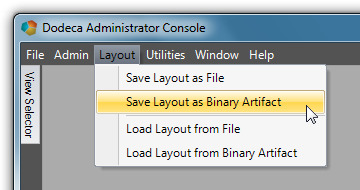
The Save Layout as Binary Artifact and Load Layout from Binary Artifact tools are intended for Admin use only.
Save a layout to a binary artifact either by using the Save Layout as Binary Artifact tool or by saving the layout as a file using the Save Layout as File. Then use the Binary Artifact Metadata Editor to create a WorkspaceLayout binary artifact and import the saved layout file.
To allow users the ability to save personal layouts locally to the file system, the Save Layout as File and Load Layout from File tools must be added to the User application toolbars configuration.
Here are a few caveats to keep in mind when working with workspace layouts:
-
Any view or saved view that was deleted after the layout was saved or cached is ignored when the layout is loaded. In other words, no error displays when a layout contains a non-existent view.
-
A workspace layout does not retain content-related information for the views that are open when the layout is saved or cached. When a layout is loaded, each view in the layout is automatically opened in the same way the user opened the view from the view selector. All of a view’s current metadata settings are applied, and if the view contains selectors, the default selections are set based on the current configuration and not on the selections in place when the layout was saved.
-
If the layout contains a saved view, the last version of the saved view opens
-
Since any metadata editor that is open when a layout is saved is included in the layout and opened when the layout is loaded, be careful to not inadvertently include metadata editors in layouts that non-Admin applications use.
Security
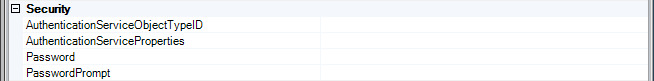
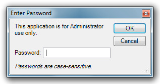
The Password property provides a simple mechanism for restricting access to an application. The most common use of password protection is to prevent non-administrator users from running an Admin application and gaining access to the metadata. You can also use the password to temporarily prevent users from opening an application for whatever reason. The PasswordPrompt property specifies the message displayed on the password dialog.
For example, this is what the login dialog looks like with the PasswordPrompt set to “This application is for Admin use only”:
| If an Admin application is password-protected and you forget the password, use the Application Setup Utility to see or edit the password. |
The AuthenticationServiceObjectTypeID provides role-based security authentication and authorization. Although password protection and user authentication both secure an application, the capabilities are completely separate and represent different levels of security. The authentication service obtains credentials from the user at startup, which the service attempts to validate through an external system. If validation fails, the application will not run. The service may also obtain the roles or groups to which the authenticated user belongs.
An authentication service is necessary when the user’s role or roles determine the views the user can access or determine the functionality available to the user. For example, workbook scripting supports the AuthenticatedUserName and IsInRole functions, which can be used to tailor the behavior of a view for a user or a group of users
The EssbaseUserRolesFromSqlPassthroughDataSets and the EssbaseUserRolesFromGroupNames are authentication services the framework provides. When an application is configured with either of these services, the user is prompted at startup for an Essbase user name and password. The service authenticates the user by attempting to connect to the Essbase database that is configured for the service.
When the AuthenticationServiceObjectTypeID is specified, the service is configured using the AuthenticationServiceProperties settings. The EssbaseConnectionID is the ID of the Essbase connection for the Essbase database used to authenticate the user. The EssbaseLoginServiceObjectTypeID indicates which login dialog prompts the user for a valid Essbase user name and password.
With the EssbaseUserRolesFromGroupNames service, if the connection is successful, the names of the Essbase groups to which the user is assigned are obtained.
With the EssbaseUserRolesFromSqlPassthroughDataSets service, if the connection is successful, you can optionally configure the service to query a relational database for the role or roles to which the user is assigned.
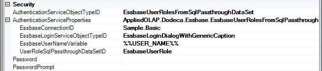
The UserRoleSqlPassthroughDataSetID is the ID of the SqlPassthroughDataSet that defines the query. The EssbaseUserNameVariable is the placeholder text within the WHERE clause of the SELECT statement to be replaced with the name of the authenticated Essbase user.
For example, let’s assume a relational database table named UserInRoles exists that maps a user to one or more roles. A RoleName column contains the name of a role and a UserName column contains the name of a user. Using a SqlPassthroughDataSet configured with the following SELECT statement along with the EssbaseUserNameVariable property set to %%USERNAME%%, the EssbaseAuthenticationService queries for the role names associated with the authenticated Essbase user.
SELECT RoleName FROM UserInRoles WHERE UserName = '%%USERNAME%%'
This is only an example. The EssbaseAuthenticationService does not require any particular database schema. The administrator can create and configure the SqlPassthroughDataSet as appropriate for the database schema that contains the user to role mappings within their environment.
In addition to the authentication service the framework provides, the framework’s extensibility model supports the implementation of a custom authentication service, which can also expose any metadata properties that are necessary for configuring the service.
Refer to the View Selector section below for instructions on using the authentication service to control the views displayed by the view selector.
Session Caching
The session cache is a client cache that stores data, such as resolved selector lists and SQL pass-through datasets, for the duration of a session. Session caching improves performance by reducing the number of client to server requests. The SessionCachingEnabled setting enables or disables session caching. This setting is enabled by default.
When session caching is enabled for an application, the administrator controls whether an individual SQL passthrough dataset or selector list uses the session cache. Refer to the SQL Passthrough DataSet metadata editor and Selector List metadata editor sections for more information about session caching.
You can view the contents of the local session cache with the Admin > Cache Viewer tool.
Splash Screen
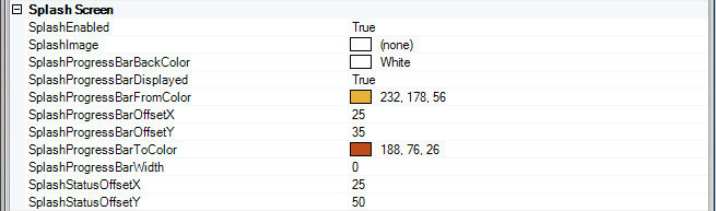
You can customer the splash screen image and progress bar using the SplashImage and other splash screen properties. Prevent the splash screen from appearing by setting the SplashEnabled property to False.
When a user imports their own splash image, it is also possible to set the gradient colors the progress bar displays to colors that are compatible with the image by using the SplashProgressBarFromColor and SplashProgressBarToColor properties.
You can hide the progress bar using the SplashProgressBarDisplayed. You can change the default location of the progress bar, which is positioned relative to the left and bottom edges of the splash screen using the SplashProgressBarOffsetX and SplashProgressBarOffsetY. The SplashProgressBarWidth controls the width of the progress bar. The status message is positioned using the StatusSplashOffsetX and StatusSplashOffsetY settings.
UI
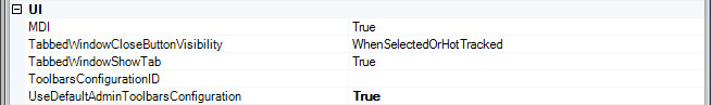
The first UI setting, MDI, determines whether multiple tabbed windows are allowed. This setting defaults to True, and is set to False when an application allows only one view to be open at a time in the workspace.
The UI settings also include the application-level toolbars configuration, which contains the main menu bar. An Admin application is typically configured with the UseDefaultAdminToolbarsConfiguration set to True, which ensures that the most current administration tools are available.
For a User application, the ToolbarsConfigurationID is used to specify which toolbars configuration contains the main menu bar. For most user applications, the View Console toolbars configuration, which is included in the Metadata Starter Kit, is sufficient.
The TabbedWindowCloseButtonVisibility setting determines whether and when the close button is visible on tabbed windows. The options include Always, WhenSelected, WhenSelectedOrHotTracked, and Never. By default, the property value is WhenSelectedOrHotTracked.
When the property value is WhenSelected or WhenSelectedOrHotTracked, each tabbed window contains a close button that is only visible when the window is selected or, in the case of WhenSelectedOrHotTracked, when the mouse is over the tab.
When the property value is Always, the close button is always visible on all tabbed windows.
When the property value is Never, the close button is located at the right edge of the tab group area.
View Selector
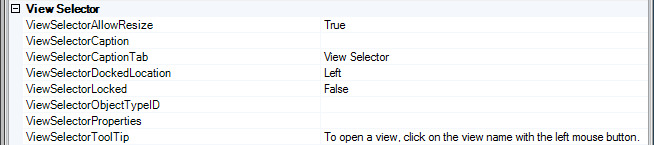
The view selector is a dockable and floatable window that displays the list or hierarchy of views that can be opened from within the application. The ViewSelectorDockedLocation determines the initial location of the window, which is docked at the left side of the workspace by default. The ViewSelectorLocked setting controls whether the user is allowed to drag and float or drag and dock the window at another side of the workspace.
A docked view selector window can be pinned and unpinned by the user. When pinned, the window content is visible at all times. The ViewSelectorCaption value is the caption displayed in the window’s title bar, which is empty by default. When unpinned, a tab on the docked side represents the window, which slides out when the mouse hovers over the tab. The ViewSelectorCaptionTab value is the tab’s caption, which defaults to “View Selector”. The tooltip that displays when the mouse hovers over the window’s title bar is the ViewSelectorToolTip value, which defaults to “To open a view, click on the view name with the left mouse button.”
The ViewSelectorObectTypeID specifies the view selector as either the ViewSelectorExplorerBar or the ViewSelectorTree.
The ViewSelectorExplorerBar emulates the look and feel of the Explorer Bar in the Windows XP Explorer. It is well suited for displaying either a flat list of views or groups of views that are organized based on categories. Each category is represented by a group within the Explorer Bar that can be expanded and collapsed. When none of the views are categorized, the list of views is displayed without a group header.
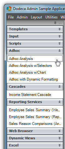
The ViewSelectorTree is used when the views are organized in a multi-level hierarchy where the branch nodes represent categories or sub-categories and the leaf nodes represent views or workspace layouts.
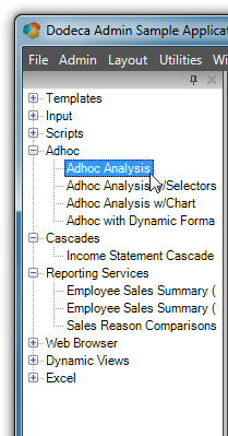
Each view selector supports a context menu, which is displayed when the right mouse button is clicked anywhere within the selector. For the View Selector Explorer Bar, the context menu can be used to expand or collapse all groups and to refresh the content. For the View Selector Tree, the context menu can be used to expand or collapse all nodes and to refresh the content.
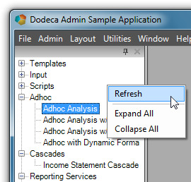
| Using the context menu to refresh the view selector content is a convenient way for an administrator to be able to modify the content of a hierarchy currently displayed by the view selector and see the changes without having to exit the application. |
When the ViewSelectorObjectTypeID is ViewSelectorExplorerBar, the ViewSelectorProperties contain additional properties that are used to configure the View Selector Explorer Bar.
The ViewSelectorExplorerBar groups can be either collapsed or expanded when the view selector is initially displayed. With AutoExpandGroups set to False, the groups are displayed as collapsed. The appearance of the Explorer Bar is controlled by the ExplorerBarStyle property, which defaults to Office2007. For the style of the Explorer Bar to be visually consistent with the appearance of the application, the application’s ApplicationStyle and the view selector’s ExplorerBarStyle values should be consistent.
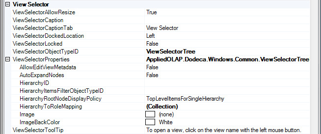
When the ViewSelectorObectTypeID is ViewSelectorTree, the ViewSelectorProperties contain additional properties that are used to configure the View Selector Tree.
For the ViewSelectorTree, the tree nodes can be either collapsed or expanded when the view selector is initially displayed. The AutoExpandNodes setting is False by default, which displays the nodes as collapsed.
The HierarchyRootNodeDisplayPolicy controls whether a root node is added to the View Selector Tree for a hierarchy or for each top level hierarchy item. The options include TopLevelItemsForSingleHierarchy, TopLevelItems, and Hierarchy.
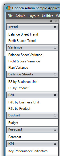
For example, assume that a hierarchy called Analysis is defined.
This screenshot shows the Analysis hierarchy in the View Hierarchy Metadata Editor.
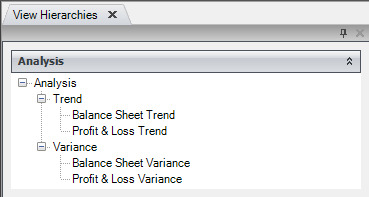
The hierarchy contains two top level items, the Trend and Variance categories.
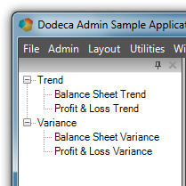
The View Selector Tree can be configured to display a root node for the hierarchy, Analysis, with a child node for each of the top level items, Trend and Variance.
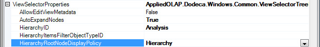
With HierarchyID set to Analysis and HierarchyRootNodeDisplayPolicy set to Hierarchy, View Selector Tree displays the hierarchy as the root node and the top level items as child nodes.
Alternatively, a root node can be displayed for each top level item.
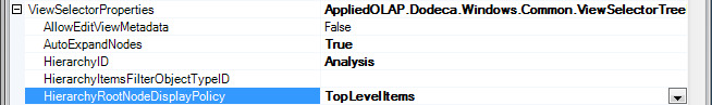
With HierarchyRootNodeDisplayPolicy set to TopLevelItems, the View Selector Tree displays the Trend and Variance categories as the root nodes.
The ViewSelectorExplorerBar and the ViewSelectorTree have several properties in common, including AllowEditViewMetadata, HierarchyID, HierarchyItemsFilterObjectTypeID, HierarchyToRoleMapping, Image, and ImageBackColor.
When the AllowEditViewMetadata setting is True, the view selector’s context menu provides direct access to each view’s related metadata. The user can navigate directly from a view in the view selector to the view’s metadata in the View Metadata Editor. If the view is assigned a workbook script, the user can navigate to the workbook script’s metadata in the Workbook Script Metadata Editor. Similarly, if the view is an Excel view or an Excel Essbase view and is assigned an Excel template, the user can navigate to the Excel template binary artifact in the Binary Artifact Metadata Editor.
-
The AllowEditViewMetadata property should only be set to True for an Admin application, since doing so gives the user direct access to the metadata.
To display an image, such as a company logo, at the top of the view selector, use the Image property. Since the image is not stretched to fill the space, an image with a solid background color works best. Set the ImageBackColor to the background color of the image. The height of the space allotted for the image is set to the image height. The image is centered, and is scaled only when the width of the view selector is narrower than the image.
For both the ViewSelectorExplorerBar and the ViewSelectorTree, the content of the view selector represents one or more view hierarchies. A view hierarchy refers to a metadata instance that is created using the View Hierarchy Metadata Editor. It is essentially a collection of hierarchy items, which can consist of categories and workspace layout items, along with views, that are organized either as a flat list, as categorized groups, or as nested categorized groups.
The view selector can be configured to contain the same hierarchy for all users of the application or to contain only the hierarchy or hierarchies to which an authenticated user is granted access to by way of the user’s role or roles. Additionally, the hierarchy items can be filtered based on custom business logic.
Here are the options:
-
When all users have access to the same views and workspace layouts, use the HierarchyID to specify the view hierarchy displayed by the view selector. This is the simplest approach.
-
When users perform different roles and the roles determine the views and workspace layouts they have access to, use the HierarchyToRoleMapping setting to specify which hierarchy or hierarchies contain the views that are allowed for each role. The mapping can assign one or more hierarchies with each possible role.
-
The authentication service, which is identified by the application’s AuthenticationServiceObjectTypeID setting, is responsible for obtaining the user’s roles at runtime.
-
Refer to the Security section above for more information about the authentication service.
-
When individual hierarchy items and views need to be filtered and potentially removed from the hierarchy at runtime, a filter can be implemented and integrated as a custom module. A filter removes or hides hierarchy items before the hierarchy is displayed by the view selector.
-
Since filtering can be used to enforce restricted access to specific hierarchy items or views based on user criteria determined at runtime, a filter is often used in conjunction with an authentication service.
-
For example, a filter could be used to remove any Essbase view from the hierarchy that uses an Essbase connection that the user does not have access to.
-
The HierarchyItemsFilterObjectTypeID is used to specify the filter used by the view selector.
How to Configure a View Selector to Display Role-Based Content
Let’s take a look at an example of how to configure a view selector to display a particular hierarchy (or hierarchies) for users who are assigned to a particular role.
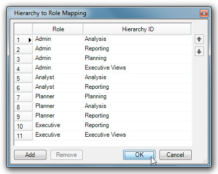
Assume that there are four possible roles defined within the environment: Admin, Analyst, Planner, and Executive. Using the dialog displayed by the HierarchyToRoleMapping property, hierarchies are mapped to each role.
-
The framework does not define the roles presented in this example. The roles the user specifies in the Hierarchy to Role Mapping dialog are the roles that are defined within their environment. The authentication service the AuthenticationServiceObjectTypeIDsetting identifies is responsible for obtaining the user’s roles at runtime from the appropriate system within the user’s specific environment. Refer to the Security section for more information about configuring an authentication service.
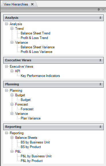
The figure below is a screenshot of the View Hierarchy Metadata Editor’s list of all the hierarchies defined for this example.
If assigned the roles of Planner and Executive, the user has access to the Planning, Analysis, and Reporting hierarchies as a Planner and the Reporting and Executive Views hierarchies as an Executive. The figures below show the content of the view selector for this user as determined by the configuration settings.
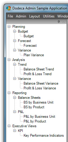
The View Selector Tree is configured with the HierarchyRootNodeDisplayPolicy set to Hierarchy, which displays a root node for each hierarchy.
The Reporting hierarchy is mapped to both the Planner and Executive roles, but appears only once in the view selector.
The View Selector Tree would also display each hierarchy as a root node if the HierarchyRootNodeDisplayPolicy was set to TopLevelItemsForSingleHierarchy, since the user has access to multiple hierarchies. With this policy option, a root node is displayed for each hierarchy when the user has access to multiple hierarchies. When the user has access to only a single hierarchy, a root node is displayed for each top level item.
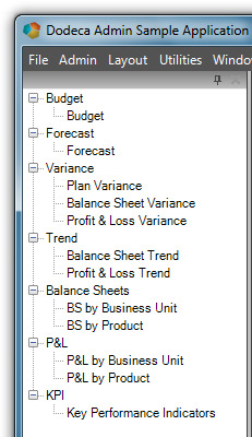
The View Selector Tree is configured with the HierarchyRootNodeDisplayPolicy set to TopLevelItems. With this option, the top level items of each hierarchy are displayed as root nodes.
The Variance category in the Analysis hierarchy contains the Balance Sheet Variance and the Profit & Loss Variance views; whereas, the Variance category in the Planning hierarchy contains the Plan Variance view. The Variance category item in the view selector contains the views from both categories.
Although not the case in this example, if the Variance category in both hierarchies contained the same view, only one occurrence of the view would appear under the Variance item in the view selector.
For a user assigned the Planner and Executive roles, the View Selector Explorer Bar displays a group for each top level item in the Planning, Analysis, Reporting, and Executive Views hierarchies.
The Variance group contains the Plan Variance view from the Planning hierarchy and the Balance Sheet Variance and Profit & Loss Variance views from the Analysis hierarchy.